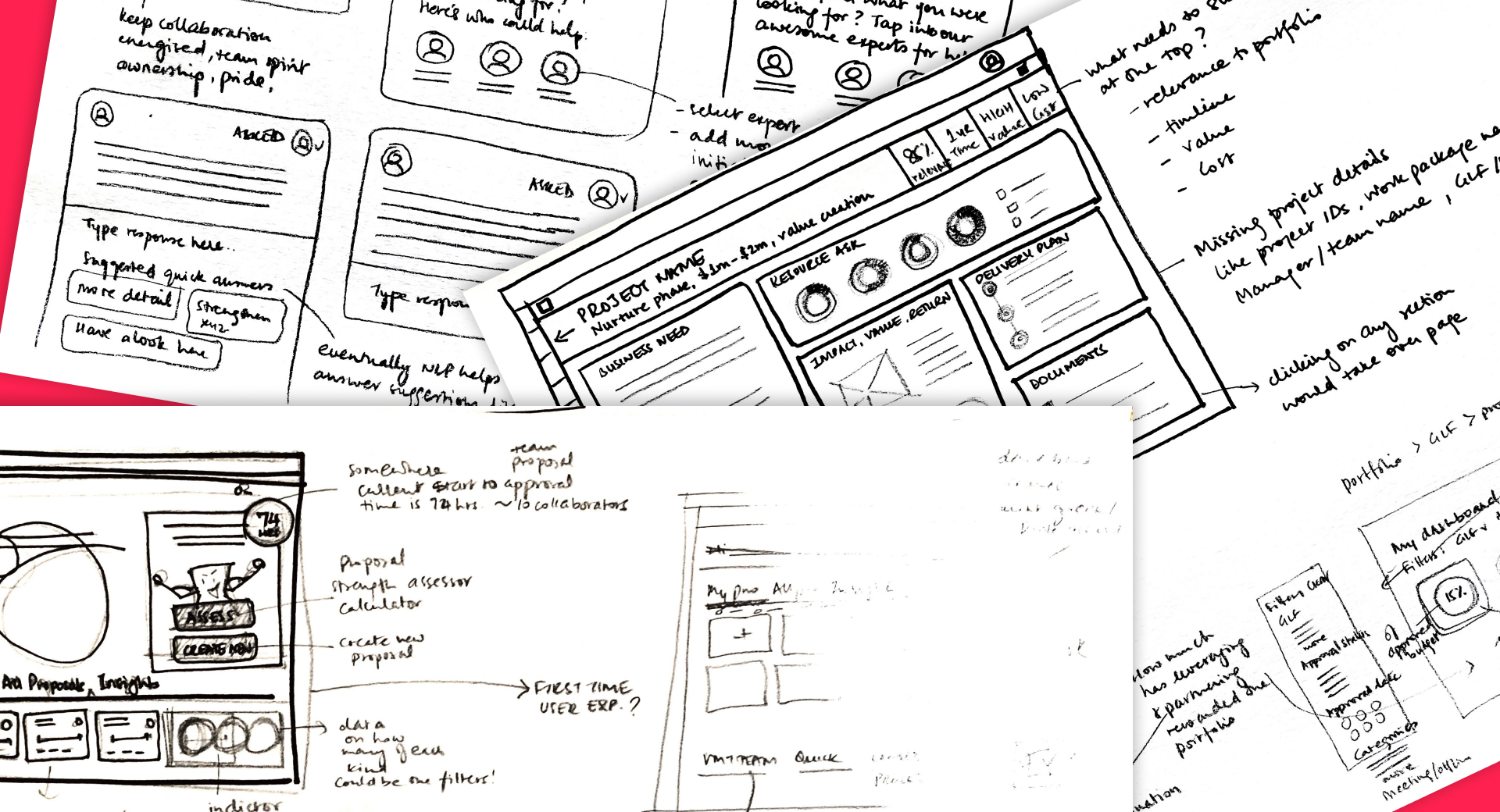
What if proposing a project didn't mean navigating a maze of documents, templates and disconnected sources of information?
I led the product design of a first-of-its-kind Microsoft Teams application for a global pharmaceutical enterprise, created from the ground up to support the journey of a project — from the first proposal and approval through to execution and delivery.
Enterprise projects rarely become complicated because of one badly designed process.
Complexity accumulates over time—new governance needs, new templates, new reporting
requirements, new systems and perfectly reasonable decisions made in isolation.
Eventually, the people trying to move a project forward inherit all of it.
I led the experience strategy and product design of a first-of-its-kind Microsoft
Teams application for a global pharmaceutical enterprise, working closely with senior
business stakeholders from early problem definition through design, delivery and
multiple product releases.
The ambition was bigger than digitising an existing workflow. We were creating a
shared environment in which project teams could develop and progress their work,
portfolio teams could understand activity across the organisation, and governance
teams could make informed decisions with greater context and confidence.
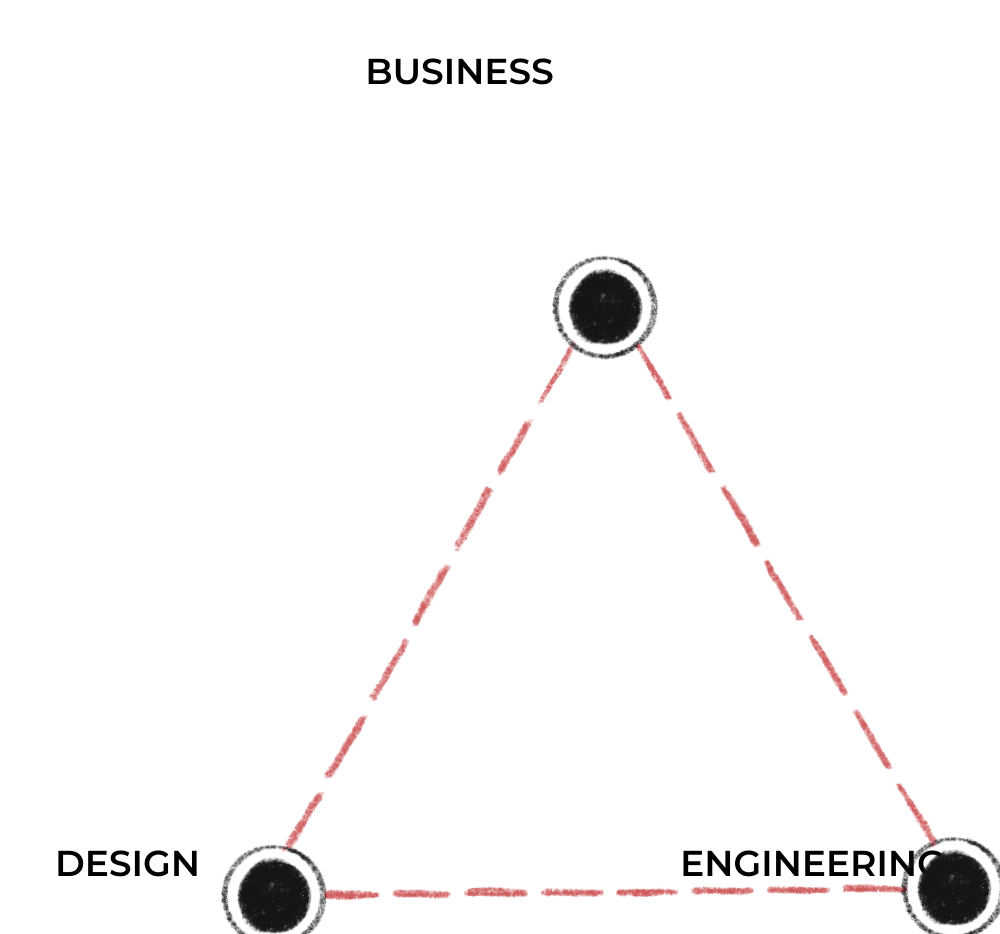
That created an interesting design challenge:
That tension became one of the principles guiding the product.
The people that were primarily part of this journey had very different needs.
The opportunity was to bring those needs together in one connected experience:
making the journey easier for the people doing the work,
while giving the business the consistency, transparency and oversight it needed.
The problem wasn't a lack of effort. It was the amount of effort required to make the system work. Looking across the existing experience, there wasn't one broken moment we could simply redesign. The same fragmented system was creating very different challenges depending on where you sat in the project journey.
Information was spread across different sources, templates and processes, creating repeated effort before the real work could progress.
NeedA clearer, guided way to develop a proposal, collaborate around it and understand what needs to happen next.
Inconsistent project information made it difficult to quickly understand what was happening across proposals and projects without additional effort to collect and reconcile it.
NeedA consistent view across projects, with enough structure and insight to compare, understand and act on what was happening.
Reviewers needed to navigate supporting information, understand context and recognise what genuinely mattered before making responsible decisions.
NeedThe right information, at the right level of detail, at the right moment — without losing the context behind the decision.
Prior to my joining the project, the business team had run Design Thinking sessions internally and gathered knowledge about the existing experience and it's associated challenges. Much of that understanding lived across documents, workshop outputs and conversations.
My starting point was identifying and understanding the users who were part of this journey and to make sense of what we already knew.
I brought the information into Mural and began translating it into visual maps — connecting people, processes, and pain points into something we could all see and talk about together. These became focal "sources of truth" to ensure we were all aligned in our vision.
The maps became working tools: a way to challenge and validate assumptions, park questions, identify opportunity, eliminate unnecessary effort and find where the needs of project teams, portfolio teams and governance began to intersect.
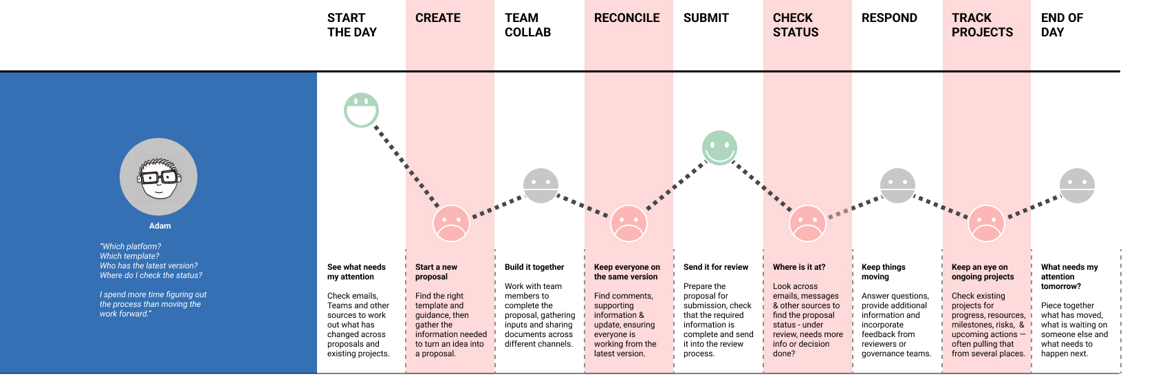
Conceptual reconstruction created for this case study. No confidential client material is shown.
Simplification in an enterprise environment isn't the same as removing steps.
Some controls exist for good reasons. Some information really is necessary. Different governance groups have different responsibilities, and a project genuinely changes as it progresses.
So our question became more precise:
Through frequent working sessions with senior business stakeholders, I used the visual models and early concepts to work through that question together.
Rather than treating requirements as a list to translate into screens, we explored the consequences of individual decisions across the whole experience.
- If we asked a project team for this information here, who needed it later?
- Could it travel with the project instead?
- If governance needed a consistent summary, could that same structure also reduce work for portfolio teams?
- Could information captured to progress one project become useful intelligence when viewed across hundreds?
I translated these conversations rapidly into concepts and wireframes so that ideas could be made tangible, challenged and refined.
In practice, my role sat somewhere between experience strategist, lead designer and product partner, helping the business not only determine how the product should work, but continually clarify what the product needed to be.
The breakthrough was to stop organising the experience around documents and start organising it around the project.
The Project Card became the persistent identity of that project—beginning as a proposal and evolving with it through review, decision and delivery.
Rather than creating a new document at every stage, the same Project Card evolves as the work moves forward — giving the project a consistent identity while making its current state immediately visible.
Illustrative representation only — no client interface or project data shown.
Create, collaborate, understand what comes next and keep the project moving.
Access projects consistently, compare them and understand the wider pipeline.
Review what matters, discuss it, make decisions and keep the rationale with the project.
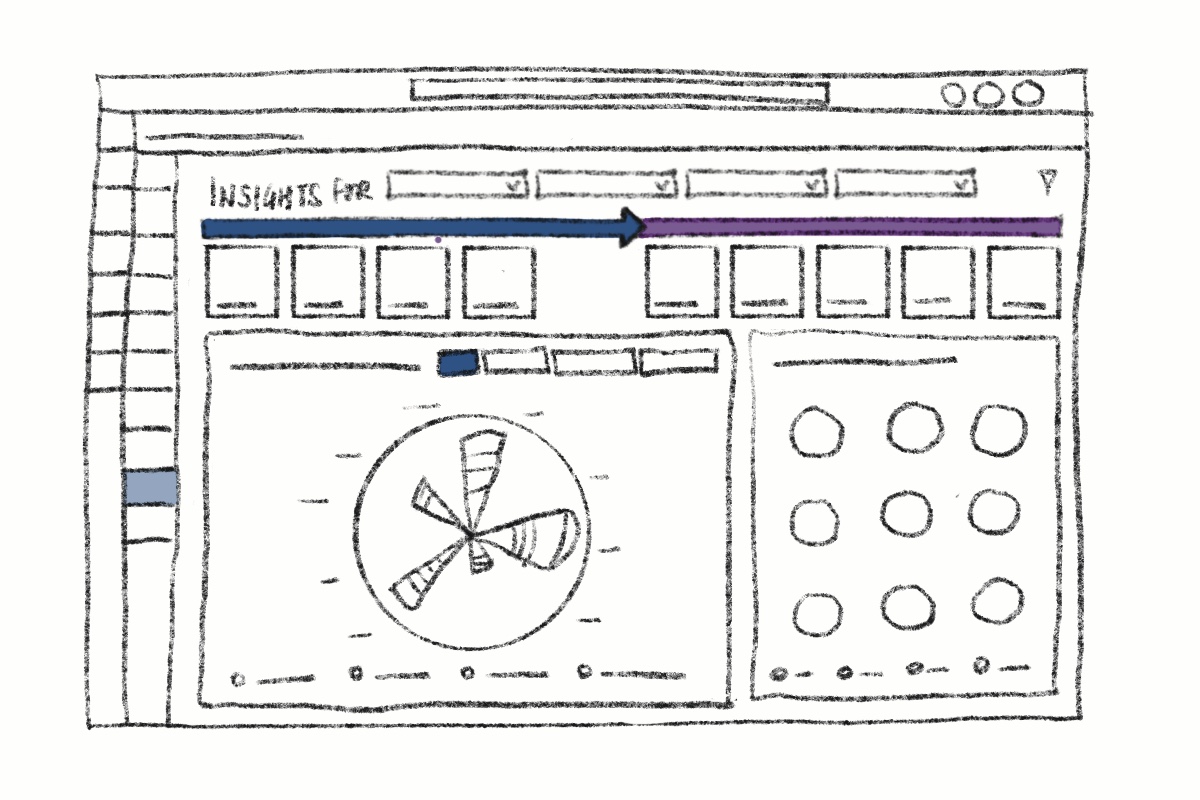
From individual projects to portfolio intelligence. Consistent project information creates a shared view of the pipeline, helping teams explore patterns across status, spend, business area and value.
A consistent Project Card meant projects could finally be viewed through the same lens. Instead of spending time assembling information before they could understand it, portfolio teams could begin with the bigger picture.
That consistency also created the foundation for portfolio insight by letting people explore the pipeline through dimensions such as time, business area, stage, status, spend and value.
Instead of building a dashboard over fragmented information, we were creating the information foundation that made meaningful portfolio intelligence possible.
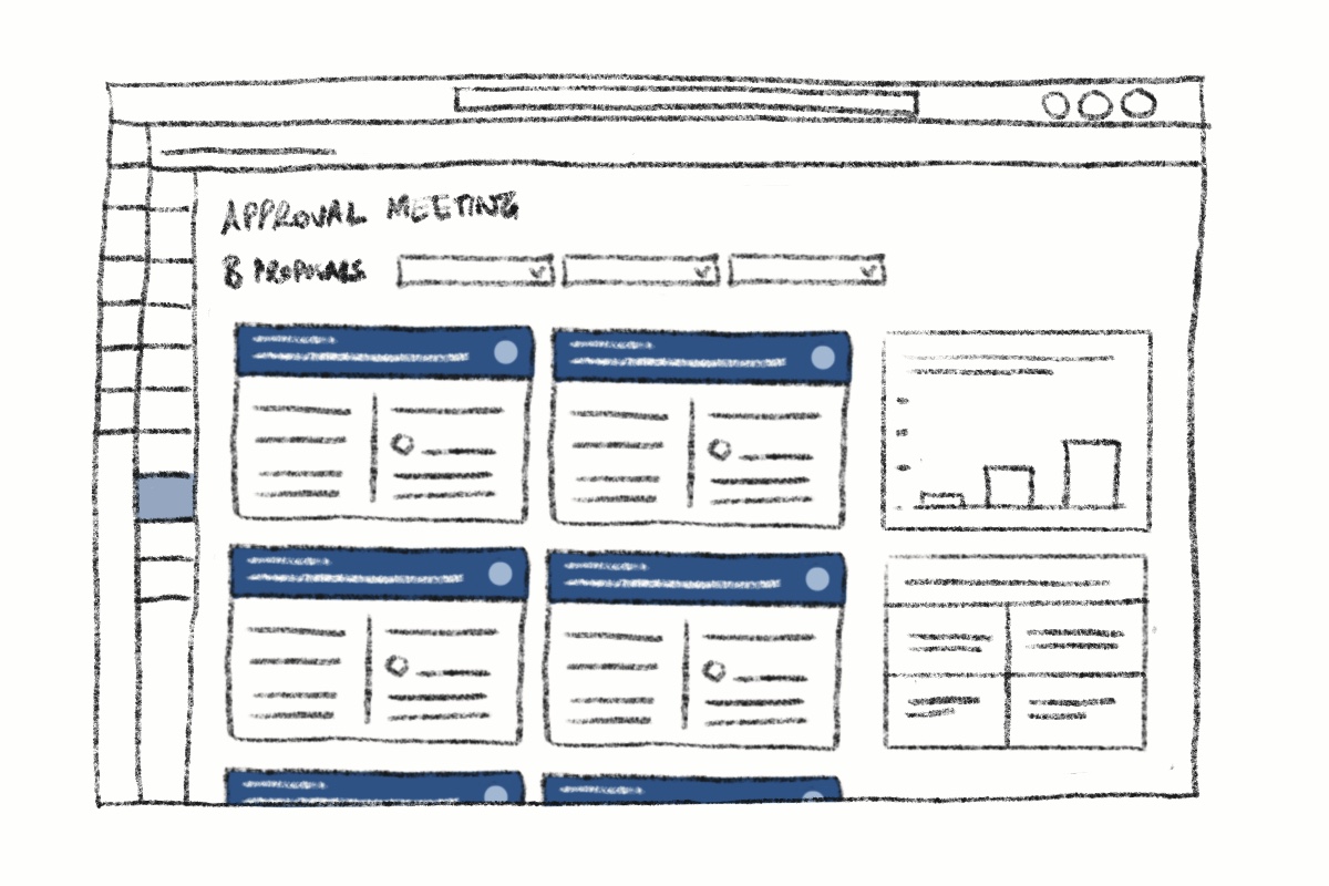
Bringing the decision into the same experience. Reviewers can see the context they need, discuss proposals and record decisions without piecing the story together across multiple sources.
Reviewers weren't the source of the friction. They were users with a difficult job: understand the business need, investment, risk and impact, ask the right questions, and make a responsible decision.
Our opportunity was therefore to remove the administrative friction surrounding it so attention could move towards the quality of the decision.
Early decisions drew on existing research, Design Thinking outputs and stakeholder knowledge. As direct access to users became possible, I introduced task-based research and interviews into successive releases.
Across 6+ releases, real use continually challenged assumptions and informed what we designed next.

I stayed closely involved with engineering through implementation — working through edge cases, technical constraints and data visualisation, while using mid-sprint reviews and stakeholder demonstrations to keep the experience coherent.
It became shared product ownership rather than a design-to-development handoff.
Enterprise software is still used by people.
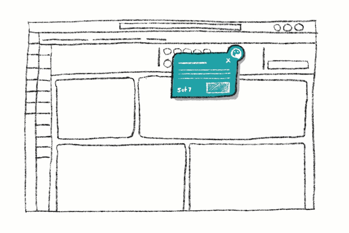
A guided first-time experience helped people orient themselves without needing to understand the organisational machinery behind the product before they could begin.
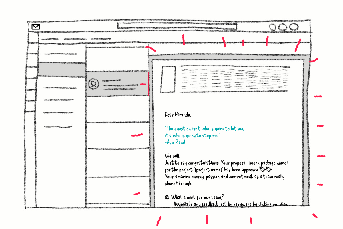
Notifications had a functional job to do, but we introduced wit and warmth where appropriate so routine interactions still felt considered and human.
Small moments don't transform an operating model. But they do acknowledge the person on the other side of the interface.
We measured success against three ambitions: making the journey simpler, helping work move with less friction, and creating greater transparency across the portfolio.
Less process for users to interpret. Greater consistency in how projects moved through review and approval.
Reduced unnecessary data entry, mistake-proofed interactions and rule-based approvals helped remove avoidable effort while maintaining the controls the organisation needed.
Less uncertainty for individuals and greater situational awareness for portfolio and governance teams.
The strongest enterprise experiences don't make complexity artificially disappear. They understand why it exists, what still serves a purpose, and what the product can carry so the user doesn't have to.