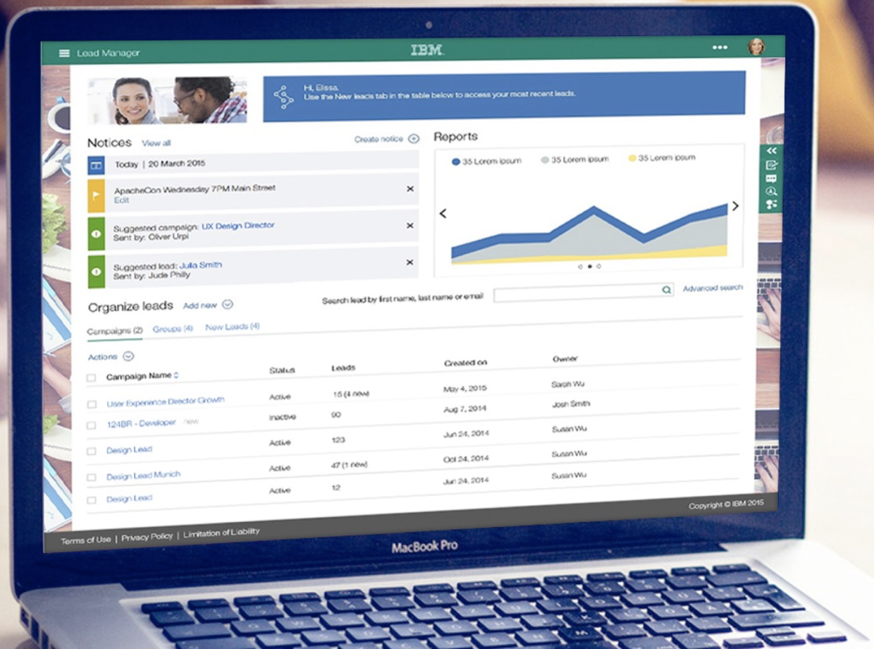
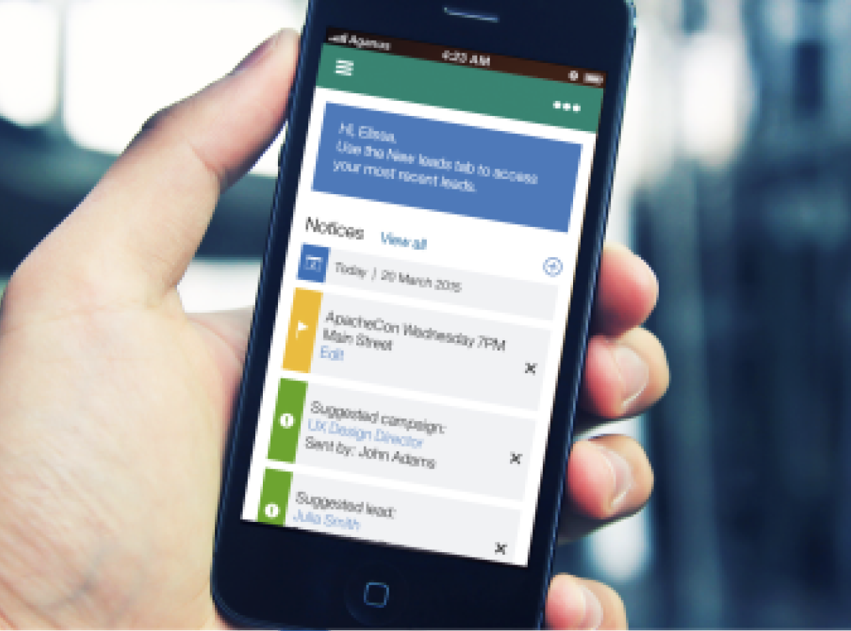
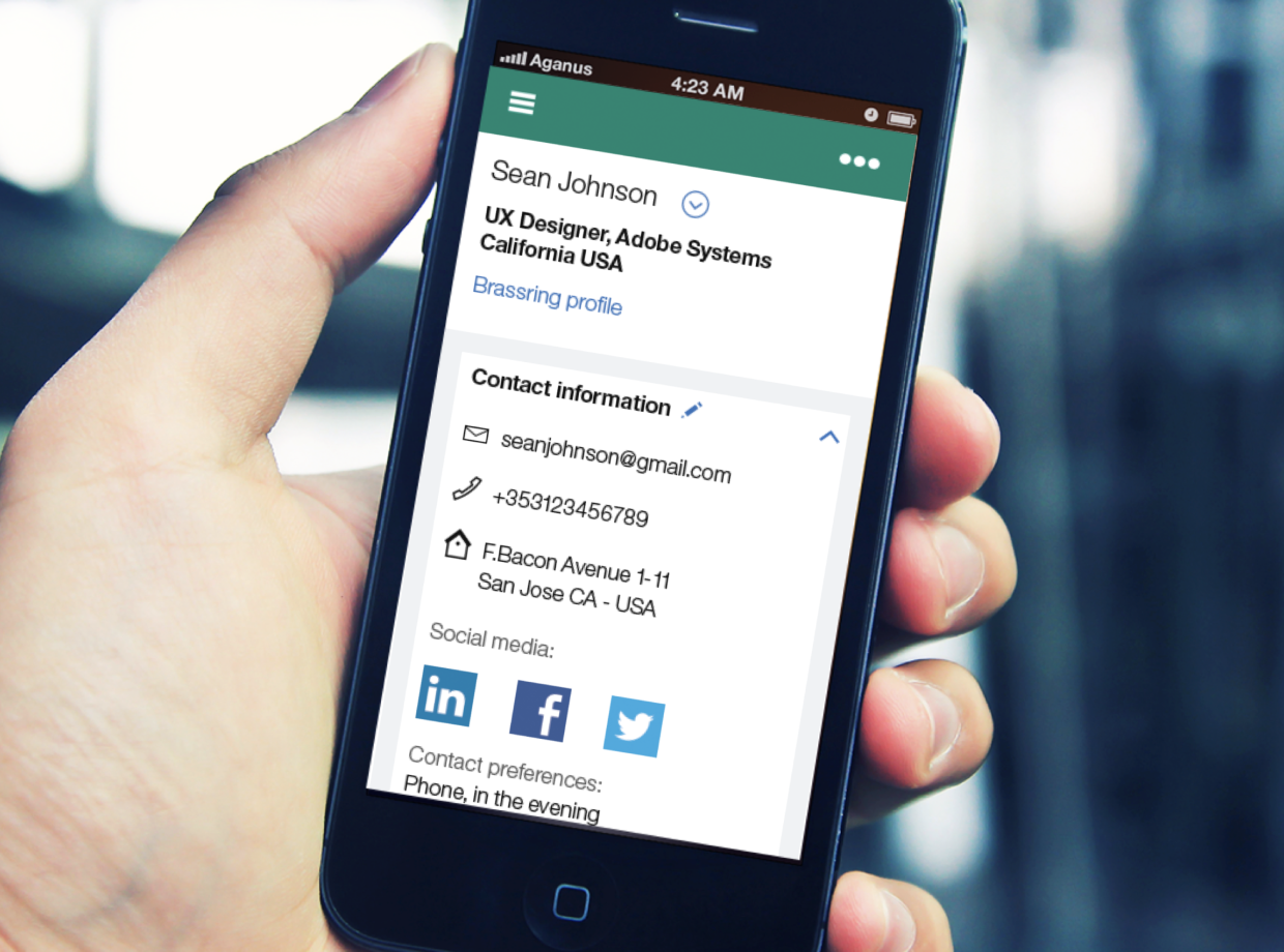
IBM Kenexa Lead Manager enables recruiters to proactively source, attract, engage and nurture top talent to build lasting candidate relationships and robust pipelines.
This project involved creating a tool to help sourcers, recruiters and hiring managers search passive candidates and nurture relationships that enticed them to apply for jobs.
IBM Talent Management Solutions was looking to expand into the realm of Sourcing - organizations reaching out to passive potential candidates, creating and nurturing a relationship with them to create a robust and warm pipeline of applicants for when a relevant position opened up - ultimately reducing the time to hire process and increasing the efficiency of the org from a bottom-up approach.
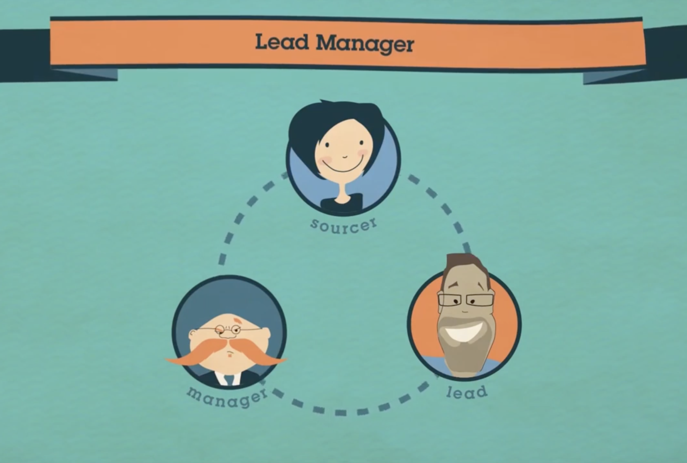
1 Product manager, 1 UX Designer, 1 Visual Designer, 1 Front-End developer, 3 Back-end developers, 2 QA engineers, 2 Implementation consultants.
I was brought into this project at a time when wires were in progress for the latest solution. To truly understand where the solution was coming from, I took the time to pause, reflect and observe who were our users, what were their current challenges in getting their work done, what was the space within which this solution would compete with other solutions, and ultimately how could we get our users to their happy place at work.
Lead UX Designer :: Complete user experience design of the product from ideation to completion.
Visual designer (partial) :: Using the IBM Design Language, designing some pages of the UI.
Using the IBM Design Thinking framework, the project was based on the foundation of - user centric design - working with multi disciplinary teams - towards a scalable plan that aimed at continuous delivery. The process started with working with the Product Manager and understanding the market trends, user and competition followed by various team based activities that led to the final product.
The Product Manager defined the business need of the project based on market and other pertinent research. This was shared with me and my Visual Designer and I set out to validate, and if required reframe, these keeping the user at the center.
A means of finding qualified leads / passive candidates and market them until they become an actual candidate/employee.
To nurture the relationship with qualified leads.
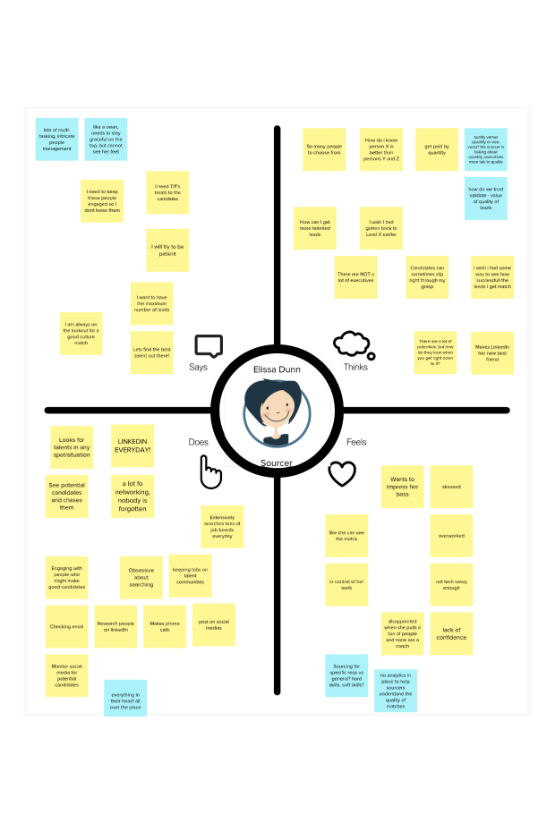
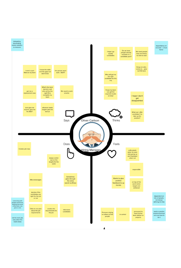
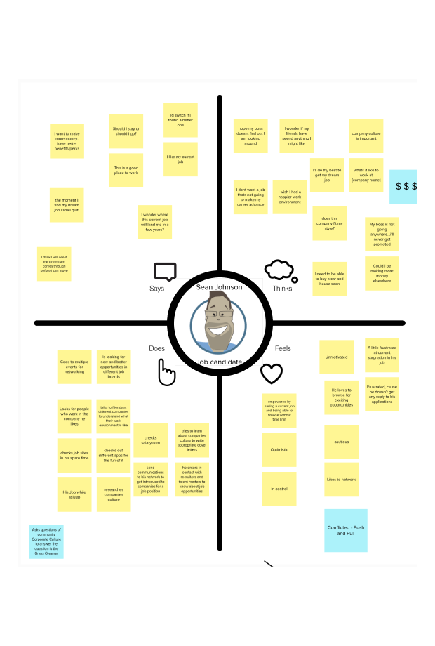
I and a colleague of mine conducted multiple user interviews with sourcers, recruiters and hiring managers. We then created empathy maps with the larger product team to generate an understanding of and for the users. I then went on to create personas based off all of this information.
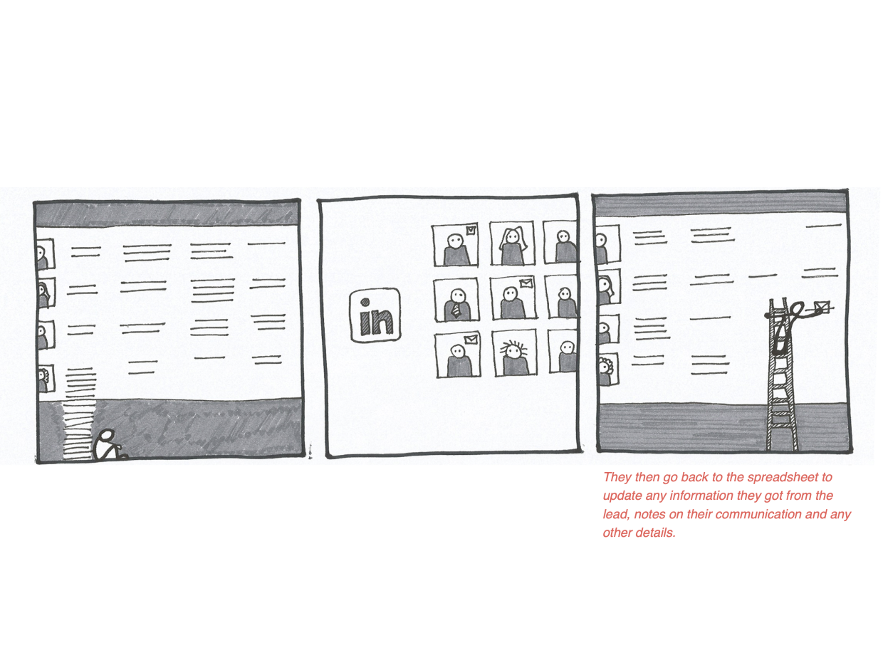
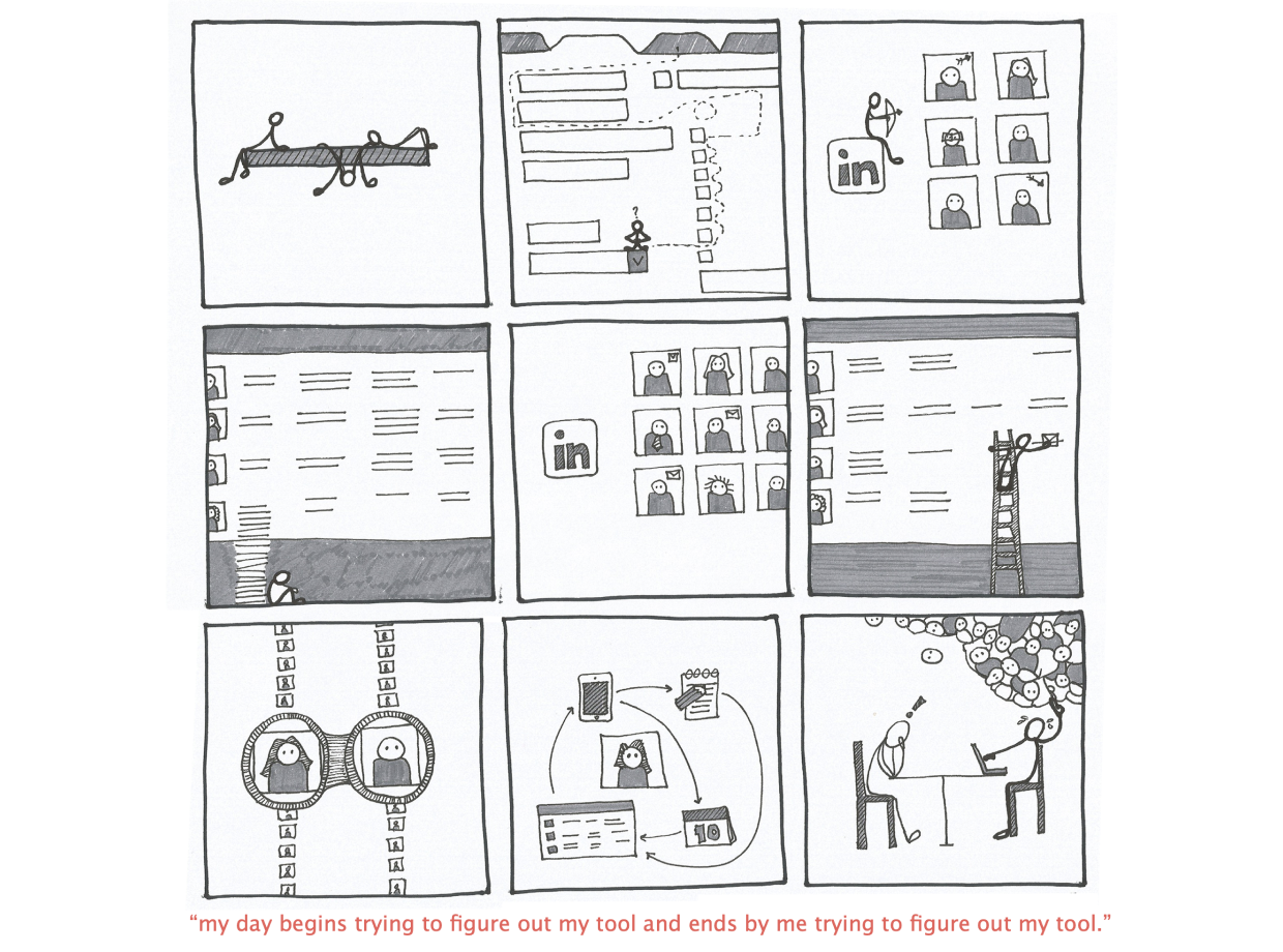
Mapping out the current workflow of the user was next. I put together a story based on all the research we had so far and this helped identify the painpoints, gaps and opportunities within the current workflow for the user.
Based on this, the user needs were crafted as a team including developers, QEs, Product Managers such thet we were aligned on the vision of what we’re building and the why and what of that.
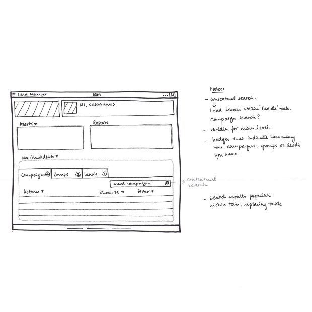
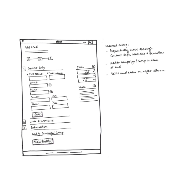
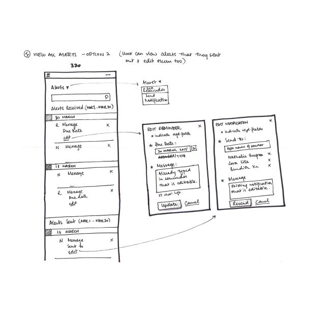
Putting together a sitemap and sketching ideas and directions this could be taken in was next on the list. Starting with hand drawn sketches helped me fail fast and learn faster, getting a multitude of ideas out.
As we tested these in the form of paper prototypes with users, we were able to establish a direction and then I started hi-fi wires and interactive prototypes. We design mobile first and were designing for 3 breakpoints - mobile, tablet and desktop.
My colleague Visual Designer and I worked closely on the visual designs and kept tweaking, testing and refining the design as we went through the process. 90% of the visual design work here is by him. More can be seen in the promotional video project.
On experimenting and looking further, I used enamel-coated magnet wire that was generally used to create coils within motors. The wire is super thin and the enamel needs to be scraped off to make contact. With the new wire I recreated the individual units with LEDs at the bottom of the wire and vibrations motors at the top such that everytime the motor got activated it made the structure vibrate and seem as if the memory is buzzing.
Completing all expertise checkpoints:
Accessibility
Design language
Heuristic evaluation
Copy review
Mobile